On a platform where millions of videos compete for attention, every detail matters. A well-chosen thumbnail font can elevate your content, helping it stand out from the crowd while enhancing readability and overall engagement with your video.
Today we'll be diving into a few of the best fonts to use for your YouTube videos and how you can utilize them to your advantage in your video thumbnails.
What Font Does YouTube Use?

YouTube's current default font is YouTube Sans, a bold font designed specifically for the video platform that has become as distinctive as any other well-known brand logo.
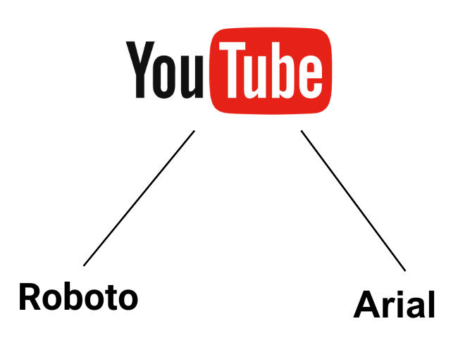
Aside from its logo design, YouTube utilizes a range of fonts, including Roboto and Arial. These fonts are selected for their readability and adaptability across different devices and screen sizes.
If you'd like to create content using a font YouTube uses, tools like WhatFontIs can help identify these fonts.
Best Fonts for YouTube Thumbnails
If you want to branch out from YouTube fonts and utilize something unique to help your content stand out, there are plenty of options, but first there are a few things to consider when you create YouTube thumbnails.
First, you should prioritize readability over anything else. This means selecting a font size that can be easily viewed in the video thumbnail on both the YouTube desktop site and the mobile app. The best font is the most readable font!
Font styles are also important, and a sans serif typeface will usually be the most easily readable and accessible for your audience.
Which Fonts Should I Use?

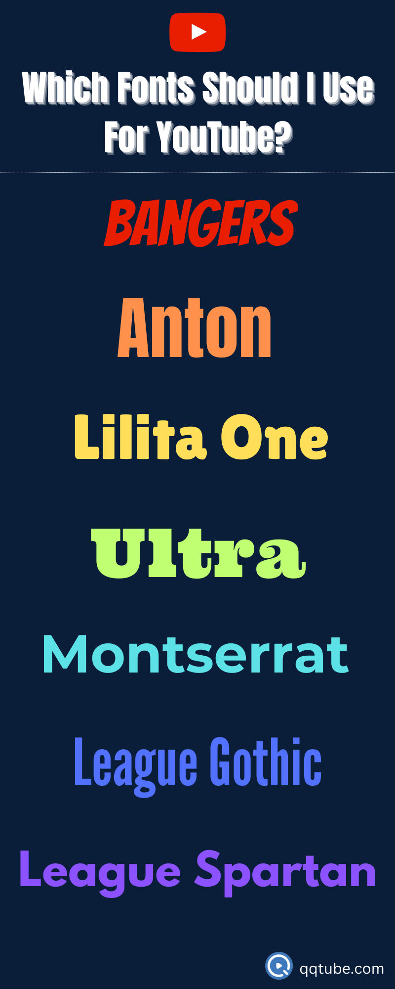
If you want to take your YouTube font choices further, fonts like Bangers, Anton, Lilita One, Ultra, Fire Sans Extra Bold, Montserrat Extra Bold, League Gothic, and League Spartan strike the perfect balance between visibility and design aesthetics, helping to make your thumbnails stand out.
Video titles aren't always the first thing that users read! Your YouTube thumbnail is arguably the most important element of your video aside from your content for this reason.
While it can be tempting to utilize cool fonts with unique design features, or a fun font that you've never seen before, it could damage your click-through rate and overall engagement if users are unable to easily determine what your content is about through the thumbnail.
Where Can I Find Fonts For YouTube?
You can find a variety of different fonts online using Google Fonts or a design tool like Canva. Free font options often have everything you need, but if you're a veteran content creator you might consider paying for a subscription to Adobe fonts for more than just the default typeface everyone is using.
Tips for Maximizing the Impact of YouTube Video Fonts
Now that you've chosen your font, there are a few things you can do to maximize its impact in your thumbnail text, including:
-
Adding color to your text to make it pop
-
Maintain consistency in font styles across your videos to establish a unique brand identity
-
Experiment with dual-font styling
-
Get creative with layout and editing of text over the thumbnail image
Choosing the Right Font for Your YouTube Content
Selecting the right font style for your YouTube content depends on the nature of your content and the brand image you want to project.
The following fonts are popular choices for YouTube thumbnails, banners, and logos:
-
Bebas Neue
-
Lato
-
Impact
-
Badaboom BB
For a more contemporary look, consider bold fonts with rounded edges like:
-
Config Rounded
-
Indigo
-
Dustin
-
Herona
Font Choices for YouTube Subtitles
While it's acceptable to get creative with the fonts in your YouTube thumbnails, subtitle fonts should always be readable before anything else.
A few popular choices include:
-
Roboto
-
Lato
-
Impact
Ensuring that your viewers can read your audio can help to increase engagement and improve viewer experience, making it more likely for users to subscriber to your YouTube channel.


